
How I Turned a Restaurant Menu Into a Service Menu
- Athiq ur Rahman
- Jan 18
- 3 min read

(A Creative Design Approach for Business Owners)

One Sunday morning, after finishing my prayer, I sat down quietly with a thought that had been bothering me for a while.
I often find it challenging to explain my services to non-technical business owners. Even worse, I didn’t have a simple, elegant way to showcase what SEOTBLE actually offers on my website homepage without overwhelming visitors. Too many services, too many words, too much thinking required from someone who just landed on the site.
That’s when I asked myself a simple question:
Which industry offers a lot, yet explains everything clearly on a single piece of paper?
Almost instantly, my mind went to restaurant menus.
Restaurants have dozens of offerings, variations, and combinations, yet customers never feel confused. You sit down, skim through, make a choice, and feel confident about it. That clarity inspired me to rethink how services could be presented.
And that’s how the idea of showcasing SEOTBLE.com services like a restaurant menu was born.
Why a Restaurant Menu Works So Well
A restaurant menu doesn’t educate you. It guides you.
It doesn’t overwhelm you with explanations. It structures choice.
That was exactly what I wanted my service menu to do.
Step 1: Starting With a Template (Without Overthinking)
I began with a single menu template on Canva.com. Instead of searching endlessly for the “perfect” template, I slightly replaced items on one existing menu just to give it structure. This step is important. A mental picture always helps.
I like to play around with a template early on. If I don’t, I tend to overthink, get stuck choosing, and eventually feel frustrated. When that happens, creativity slows down.
I prefer to follow the path of least resistance at the start so my creative energy keeps flowing.
Structure can always come later.

Step 2: Let Creativity Flow First, Structure Later
Once the creative energy is there, refining becomes easier.
After the initial structure was set, I focused on:
Brand alignment
Visual hierarchy
Consistency
At this stage, things naturally start making sense.

Step 3: Playing With Backgrounds and Brand Contrast
Initially, I experimented with a brown background. It felt warm and menu-like.
Later, I switched to black. The contrast worked better with SEOTBLE’s brand colors and made the menu feel more premium and bold.
This wasn’t a rushed decision. It evolved as the design matured.

Step 4: The Food Images Idea (Yes, I Kept Them… At First)
Here’s where things got interesting.
My original idea was to keep the food images.
I wanted visitors to feel like they were looking at a real restaurant menu, except instead of food, they were choosing digital services. The idea was to subtly trigger familiarity and even hunger signals, but redirect that instinct toward services.
Absurd? Maybe. Intentional? Absolutely.
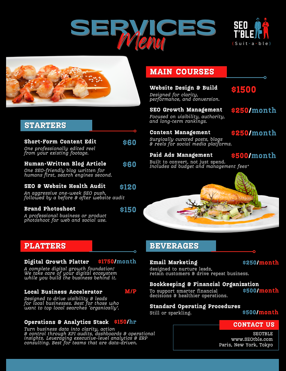
Feedback, Reality, and the Final Decision
I shared the design with friends and family. Most of the feedback was:
“Yeah, it’s good… but the food is confusing.”
And they were right.
While my idea worked conceptually, it didn’t serve a potential customer visiting the site for the first time. Clarity had to come before creativity.
So I made the decision to replace the food imagery.
That’s an important lesson in design:An idea can be great, but if it causes confusion, it has to go.
What I Would Ask You
If you were in my place:
Would you have kept the food images?
Or would you have removed them sooner?
Design is always a balance between creativity and usability. In this case, usability won.
Final Thought
This menu wasn’t created to be clever. It was created to be understood.
If this concept inspired you, or helped you think differently about how to present your own services, I hope this breakdown gives you practical insight into my process and encourages you to experiment without fear.
Sometimes, the best ideas come from the most unexpected places.


Comments